
Keep the Grid Calm
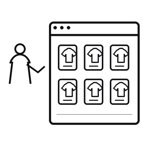
Uneven cards make the eye work harder.
One image is tall. Another is tiny. One title pushes the price down. Another card ends early.
The category starts to wobble.
Consistency fixes that.
Use similar image treatment. Similar card dimensions. Similar spacing. Similar information order.
Then customers can compare products instead of comparing layouts.
Visual rhythm is not decoration.
It is usability.
A calm grid lets the products do the talking.
Are your product cards visually consistent enough for shoppers to compare items quickly?