
Make Variants Obvious
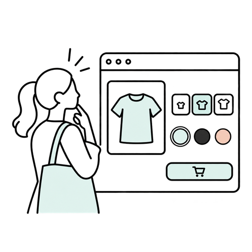
Variants are choices.
But bad variant design turns choices into puzzles.
If customers cannot quickly tell which size is selected, which colors are available, or what each option means, the product page starts working against the sale.
Keep variants obvious.
Selected states should stand out. Unavailable options should be clear. Names should make sense. Swatches should not force guesswork. Size choices should feel immediate, not ambiguous.
This matters because variant confusion creates hesitation for the exact people who are already close to buying.
And hesitation at this stage spreads fast.
A clear option is easier to choose than a confusing one.